
This Wednesday saw the first day of spring! A time for fresh starts, deep cleansing and a little less frostbite. Here in the design studio, we have been inspired by the changing season to clear out our creative backlog of recycled ideas, and open our minds to new possibilities!
We love looking for new styles, inspirations and skills that will push our design aesthetics forward, giving our clients the best possible results for their businesses.
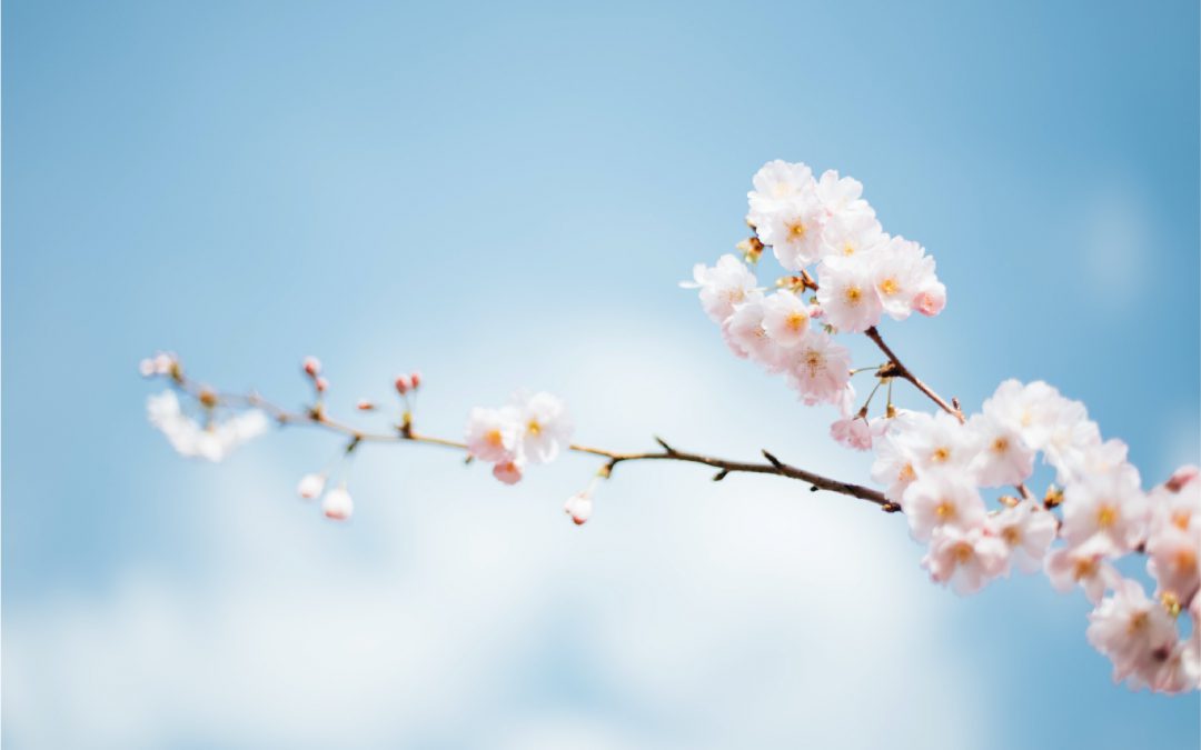
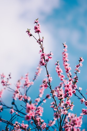
What we love best about Spring is that it brings colour back into our lives! After a dull and drab winter; daffodils, tulips and blossom litter the grey concrete walk to the office this morning.
Colour has an amazing way of affecting your mood. Not that the spring flowers could ever replace our morning coffee, it is still interesting to see how this splash of colour brings excitement and motivation into our morning commute.
For example, our brand colours are green and yellow; yellow is a warming, positive and energetic colour. This reflects on our innovate and creative nature. Green also has a similar effect, suggesting growth and development; the harmony of the two capture our pioneering ideologies and visionary thinking. This brings us to our first trend…

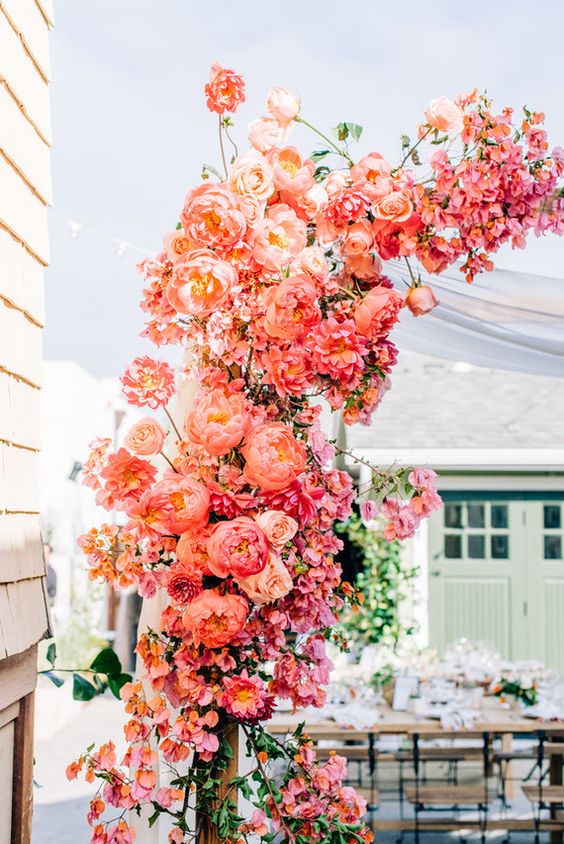
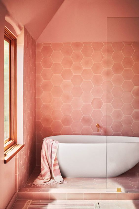
Living Coral
This year ‘Living Coral’ was named Pantone’s colour of the year 2019! It is an energic, feminine and bright pastel colour that we expect to see a lot of this year.
We, of course, love anything marine related, so this colour is right up our street… or should we say right up our estuary!
Carrying the energy of the tropical oceans Living Coral is a warming and gentle colour that soothes and calms the mind. Pink is often occasioned with romance and kindness, so if this is what 2019 has in store for us, we’ll be welcoming living coral with open fins!
Fluid and Liquid Effects
On a similar topic, the next trend that’s caught our eye draws upon an aqua influence in a different way. This contemporary and abstract notion plays around with the texture and movement of liquids. Whether it be oil, water or ink these dreamy and futurist effects have been trickling into graphic design on a range of formats.
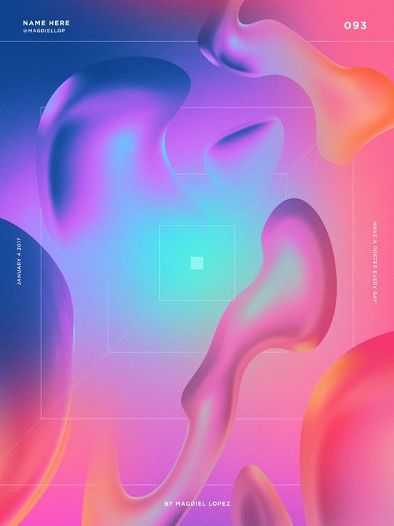
The loose and free nature of this style is created with layers of soft gradient colours that blend and build to create a cool atmosphere. Adding texture and colour to design in a unique and playful way, this trend has stimulating results when mixed with web design.
We’re excited to dip our toes into this new wave of design!
Open Compositions
The world wide web is constantly expanding, with 380 new websites being created every minute, you have to do a lot to stand out. With attention spans and patience decreasing, a typical user will spend an average of 15 seconds on a site before they bounce off to the next. That’s not a lot of time to engage an audience, but an intriguing website can increase that time to 2-3 minutes. A trend we think would extend this time is open compositions.
An open composition teases a viewer by only showing sections of a design. With no frame, the design fills a space that is much larger than the screen you are looking at. A bit like looking through binoculars at a scenic view, you are able to point and direct your view to what you want to look at. This isolates elements and allows them to grab your full attention.
This isolating effect also hides parts of a design, keeping a curious user excited to find these hidden features embedded in the site. Almost like a game, the navigator travels thorough the open composition discovering hidden elements to gain a sense of reward. This is a great way to tickle a viewers curiosity and keep them exploring a web site.
The free and open framing can be used to bring attention to details we might miss. There’s also a brain-teasing aspect of this trend, a viewer has to spend time studying an image to work out what it is. Creating designs that enable a sense of reward makes for a more memorable impact on an audience. Check these out!

There is a sense of freedom and movement coming from all these new trends. 2019 is a time for smashing out of boxes (quite literally!) allowing design to move more freely within its composition and textures. This is the year for breaking the rules and challenging the don’ts! Can you think of any design trends we’ve missed?
Let us know in the comments.


