
‘Good design is the things you notice. Great design is all the things you don’t.’
-Wim Hovens.
So, the question is.. did you noticed the Facebook icon update? If the answers no, don’t panic! The change was incredibly subtle; a slightly lighter blue with a gradient, a nudge to the left and a circular frame rather than a rounded-cornered square. With such a small difference, it begs to differ… was there any point?
Facebook are well known for their subtle branding updates. In 2015 we saw one of its most drastic updates, yet it wasn’t drastic at all! Creative director, Josh Higgins stated that “we explored many directions, ultimately we decided that we only needed an update and not a full redesign.” There’s great value in the statement here, ‘if it isn’t broke, why fix it?’
When it comes to a branding update it’s important to not lose the essence of company, but to modernise it! This is something Facebook excel in.
Facebook’s 2015 Update
Can you believe it’s been four years since this the last update! The dust has finally settled and we’ve all got used to the changes. Almost to the point where you can’t remember what it was like before! Let’s refresh your memory…
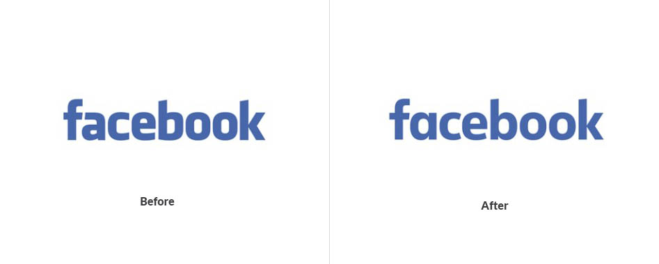

Source: https://www.underconsideration.com/brandnew/archives/new_logo_for_facebook_done_in-house_with_eric_olson.php#.VZPZ2RPtlBc
The original logo was designed by Joe Kral and Cuban Council, and created using the typeface Klavika. In 2015 we saw the logo shift to a custom made typeface. Facebook wanted to create a font that felt ‘friendlier’ than its predecessor.
You can see a subtle shift in the softness of the type; with the O and the E becoming rounder and the A losing it’s double-story height. These aspects come together to reduce the sharpness of the logo, creating a lighter feel, while still holding the same silhouette in order to keep that familiarity. So much so that the shift could almost be unnoticeable.
Did you notice the difference? If so let us know which logo you preferred in the comments below.
Updating a brand is tricky business, consumers often struggle with change but the need to grow and develop is a necessity! After a brand refresh it’s common to hear (repeatedly), ‘I liked it better before’! Even after the subtle Facebook update many users felt like it was unnecessary. Over time however, once the shock has settled people become warmer to a change and look back at what is was before and question their taste in 2015!
Even the best logos need an update every now and again!
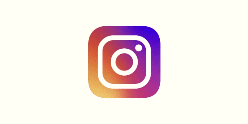
It’s been three years since Instagram saw it’s logo update! Although celebrated now, it’s safe to say this update wasn’t perceived well at the time. In hindsight you can clearly see the designers knew what they were doing. Gradients and minimalist design are increasingly growing in popularity which begs the question – Did the Instagram logo lead the way for some of the current design trends?
This is a classic example of why you should trust your designer… even if you don’t always agree!
What a journey Apple’s logo has been on! Who would have thought the minimalist brand would have started with such a complex logo!

‘Brands who stay set in their ways run the risk of losing their audiences over time. As people we change and grow so does our taste. If you were to look into your teenage selfs wardrobe, I expect you might cringe a little at the content. Similarly for a brand to continue having a long and healthy relationship with you, they need to evolve too.
In the design studio we understand your business is your baby, and rather than rearranging all its bits and bobs you might just fancy a face-lift. We can help you to evaluate what is and isn’t working in your branding and help you to move it forward!


