
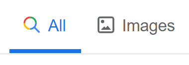
Did you notice the latest visual update to Google’s Search Bar? A subtle addition to the page brings new icons to supplement the text adding a fresh feel to the branding.
As mentioned in our previous blog post, updating the look and feel of your branding is fundamental, but was this update necessary? We’ll take a deep dive into the pros and cons of these new additions and have our say on if this is a trend that others are soon set to follow in the near future.
Icons are not new to the web design scene. Their ability to visually express actions, objects and ideas allows any user a higher probability of a more seamless experience.
Google have found a clean balance whereby the icons are not seen overpowering the design, but assist in the guidance of the user.
The new icons bring depth and interest to an otherwise text heavy layout. The new ‘active state’ colours draw the eye in whilst splashing some much needed dimension across the bar.
On the other hand, designers have been seen to apply icons in a way that can cause usability issues by hiding key functionality behind them.
When designing for an international audience, it’s worth pointing out that even an icon’s meaning can get lost in translation.
Google have bypassed these issues by adding the new features along side the current text as a way to guide the user to where they need to go. This will give the user confidence in the results of their intentions.
Why have Google updated their design? It could be assumed that this new design will pave the way for Google to eventually save valuable screen real estate by removing the coupled text. Alternatively this could be a simple freshen up of an outdated design.
We personally believe it’s the latter. The usability downfalls are far too great at this point in time to start removing key information and replacing it with potentially misunderstood imagery.
There is a large similarity between the ‘Images’ and the ‘Maps’ icons which could cause confusion on larger devices due to their small size. In our personal opinion, the ‘Books’ icon strays a little too far from the more commonly know hard cover book.
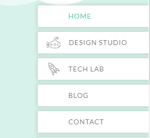
Using icons in navigation is familiar to our personal site. Since our latest rebrand we have the two additions of the Rocket and Submarine to relate to the branding we associate with our two departments – the Tech Lab and Design Studio.
Unlike Google, our icons are far less universally known and therefore wouldn’t currently have the ability to guide the user in the right direction. However it’s worth noting that icons are dynamic, constantly being impacted by our own use of them. As meanings evolve, users develop a relationship and understanding of what to expect from each icon.
Let us know in the comments below if you believe this is a trend to follow or if Google should have left it’s icons back in 2010.


