

The Design Studio have been embarking on a project to freshen up the MK9 Development branding. In this blog we are going to dive into the design journey and process of the logo.
A logo should be simple, easy to read, original, and memorable, while also capturing the essence of the brand. Due to the complex nature of the company this was bound to be no easy task.
MK9 offers services in design and technology. These two sides to the business have very different objectives which needed to be reflected in the logo. So, where did we start?
With such a unique brief our first thought was to note the fact that both sides of the business heavily relied on computers. This digital element required a custom made typeface which felt the best fit for the task. Below you will find the initial designs…
Typeface
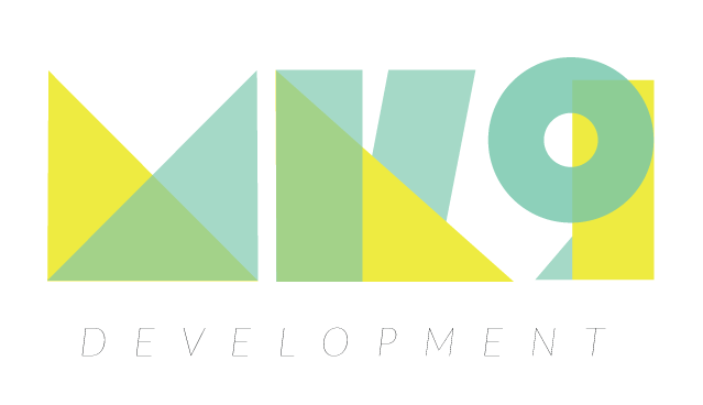
By overlapping geometric shapes we aimed to suggest a modern and sharp nature. Sleek and pointed edges gave a ‘techy’ vibe which is complemented by the bright and bold brand colours.

The 3rd example takes inspiration from a circuit board, which is memorable but complex.

The digital element is most present in this typeface; inspired by type you might find on a digital alarm clock.
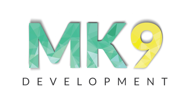 A simple logo with unique elements shown through the texture within the letters. An overlay of triangles gives the type a crystal-like effect.
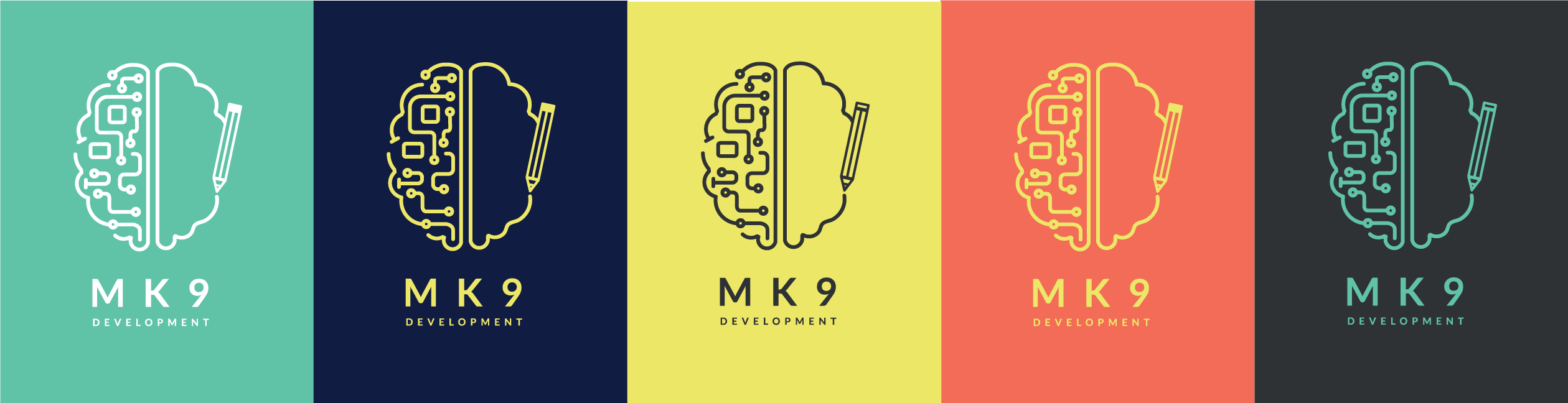
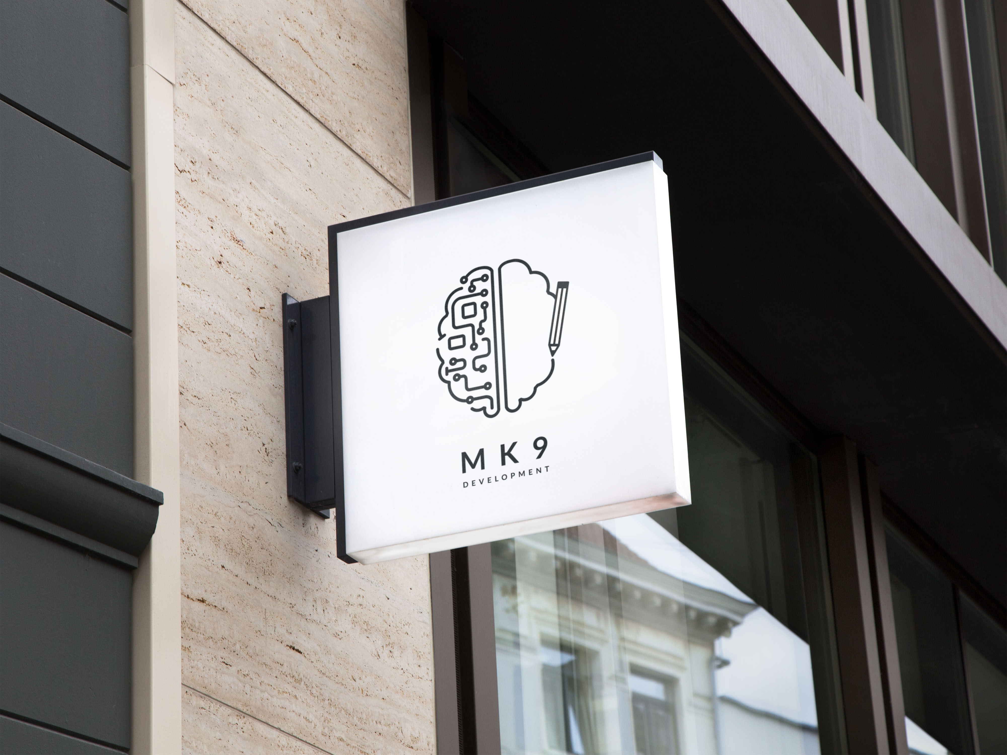
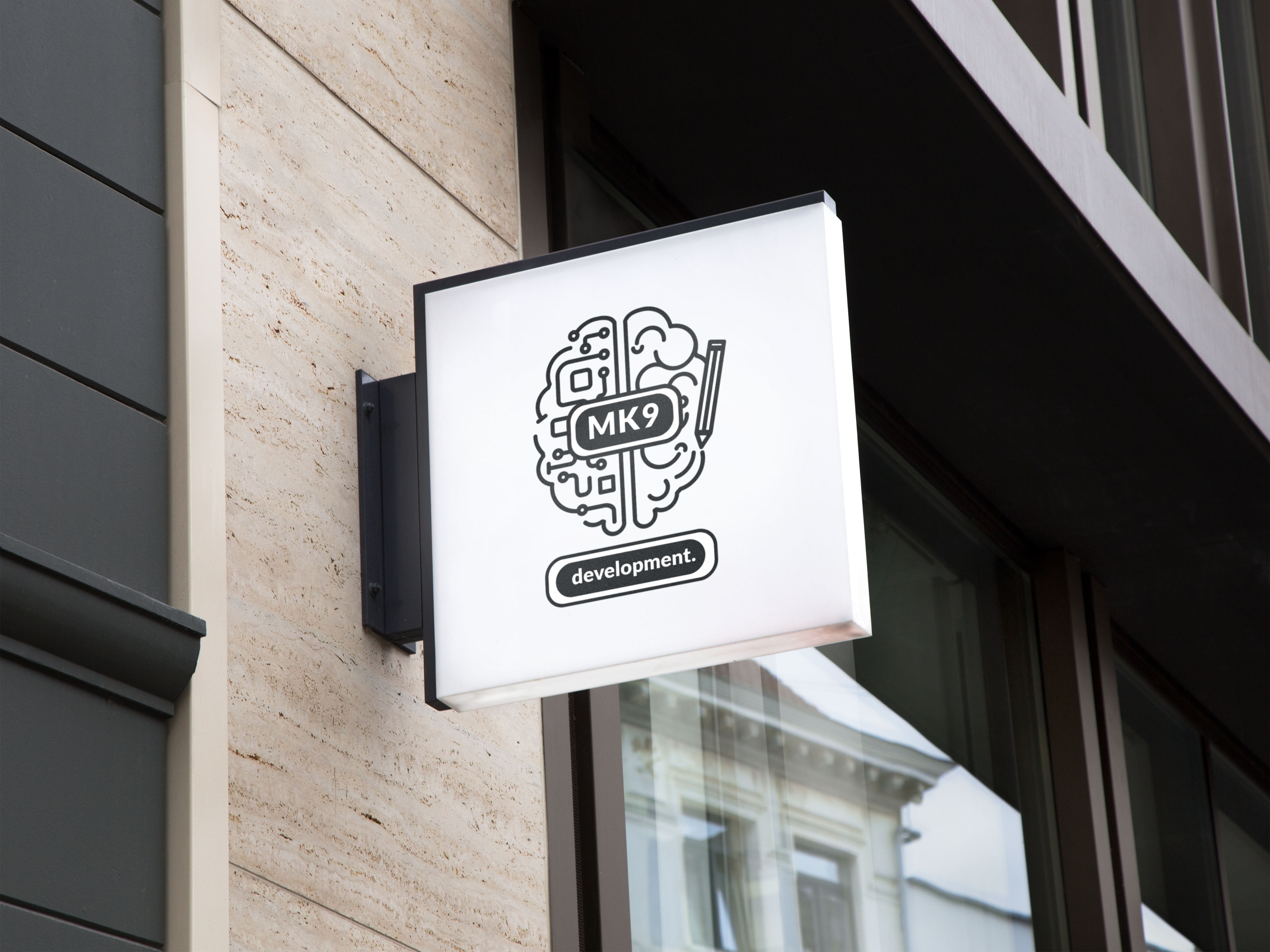
Left and Right Brain
Have you ever had someone ask you which side of the brain you are? A weird question, but the concept behind it is the basics to this next logo idea!
The question refers to which side of the brain you use the most. The left-hand side is used within logical thinking such as Maths, Science, planning, and analyzing numbers and data. Whereas the right-hand side of the brain is used within creative thinking such as art, music, 3d forms, colors, and imagination.
MK9 is a marriage between left and right sided thinkers; coders within the tech are left and the creatives in the design studio are right.

What the Phoenix?
The creative process is a tortuous trail of epiphanies, strokes of genius, coffee, and sugar. More than often these strokes of genius can lead us off brand and off colour to ideas that should have been left in a shower daydream. Still, this one snuck through, and all we can do is wonder… what the Phoenix where were we thinking?
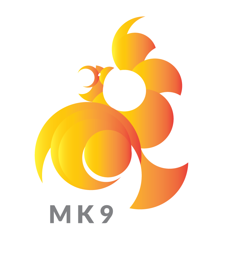
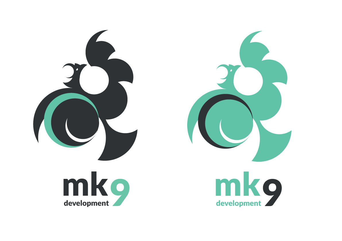
At MK9 we are all about taking our clients businesses to the next level, giving them a refresh or in other words a rebirth just like a phoenix. That’s where the thought process behind this logo was leading.
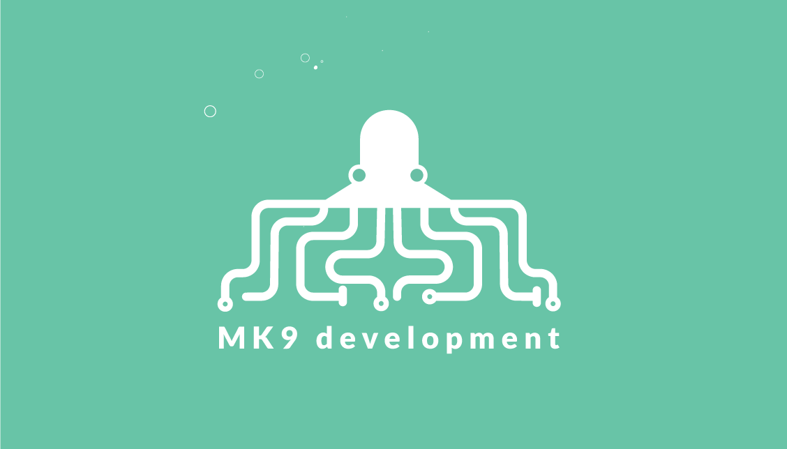
Noodles
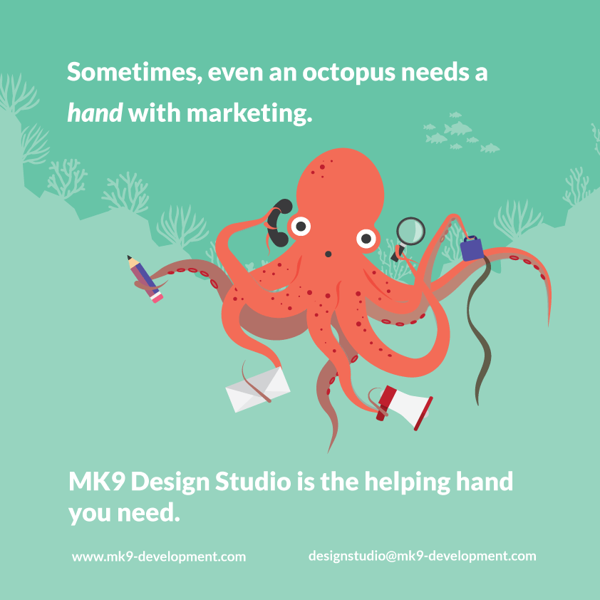
Popular amongst the design studio is the use of the octopus vector (below) who can be seen struggling with marketing errands. This vector sparked the idea to create a mascot within the logo that captured both the tech and design through the use of their themed destination.
Within the branding, the design studio travel in their yellow submarine to dive deep into design, whereas the tech lab travel in their rocket ship to outer space.
The logo could be interpreted as an alien or an octopus depending on which side of the company it would be representing. Alien for tech, and octopus for design. Take a look at noodles in action below!
Inspired by the existing flat graphic style of our current branding, this logo was fun and playful and had meaning.

Back to the Start
Many ideas had been developed, scrapped and explored by this point, and the design studio decided to regroup to take a step back at look at the progress and feedback that had been made.
A continuous comment heard throughout the project was that the logos were too complicated – choosing form over function.
What’s the best way to deliver a message? Surely it’s through text. A clear, direct form of communication. So with that, we went back to where we started and brought our focus back to type.
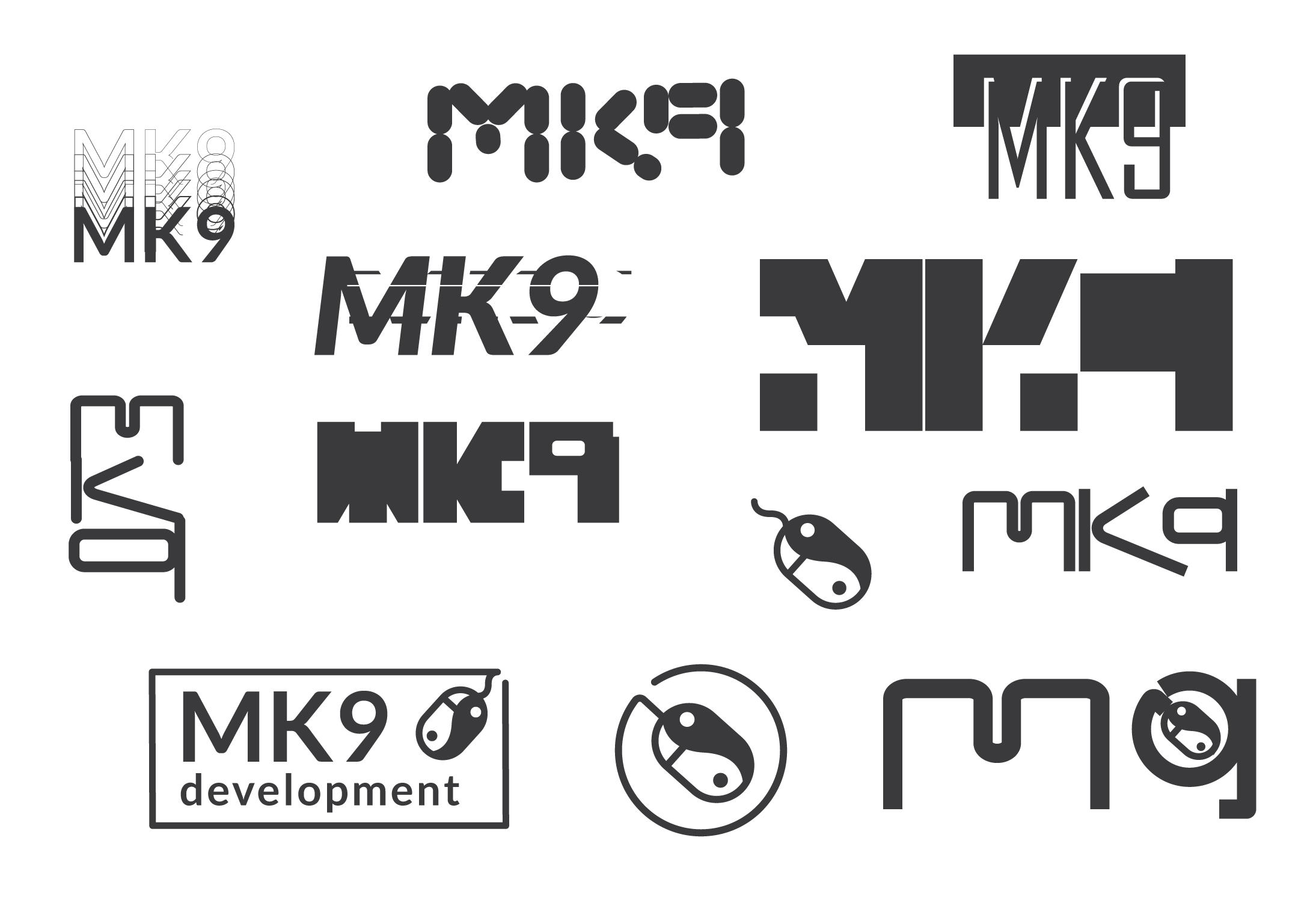
At this point in the project, we wanted to work quickly so we decided to do a visual brainstorm possible types and shapes that we could incorporate into the logo. This way of working allows for ideas to flow continuously, whether they are good or bad, there is plenty to explore!
One of the thumbnails seemed to stand out the most. With a few nips and tucks, we got to a place where we felt the logo was doing all we’d hoped it would do…
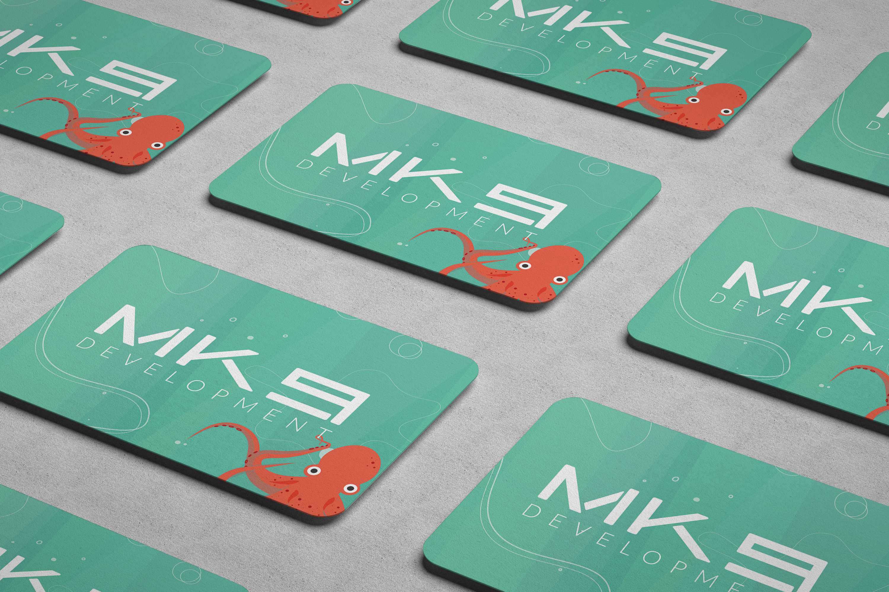
Introducing the NEW MK9 Development!
There you have it, our finished logo. A custom made typeface that has an edgy and ‘techy’ essence that is clear, simple and easy to read.
Let us know your thoughts in the comment section below! This is just the start of the MK9 Development design refresh, keep your eyes peeled for more updates to follow.


Great content! Super high-quality! Keep it up! 🙂